Odyssey.today
2021
Task
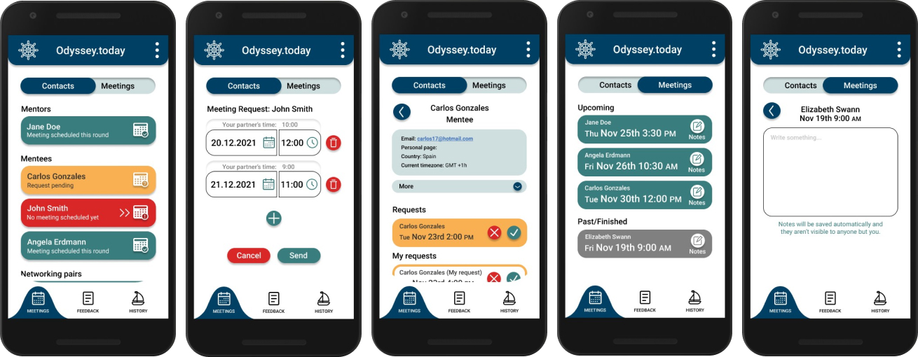
Our task was developing an application prototype for metoring and networking in the Odyssey.today program. The key features are meeting requests and reminders, storing information about the users' activity and sending feedback to partners.
My Role
UX/UI designer
Responsible for the “meetings” tab
Software
Figma
FigJam
Miro
The Challenge
In our first meeting with the client they explained to us why they wanted to implement an app. Since the members of Odyssey.today are scheduling meetings through email, the biggest challenge is that some members struggle to keep up with them. That's why it would be easier for many to have a separate tool to manage their meetings and receive reminders about them.
Target group
Most of the Odyssey.today members have found it through the Toasmasters Inernational community so there are quite a lot of different people in the target group. However, they are all adults and interested in communication and leadership skills. They are also international, which we kept in mind during the project.
Since the app is specifically intended for people who struggle to keep up with emails, the goal was to make it relatively simple and easy to use.
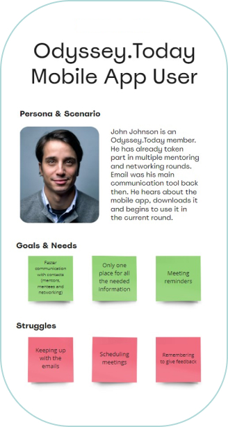
Here you can see a persona which was created based on the information our client gave us. (Made by another team member)
Flowchart
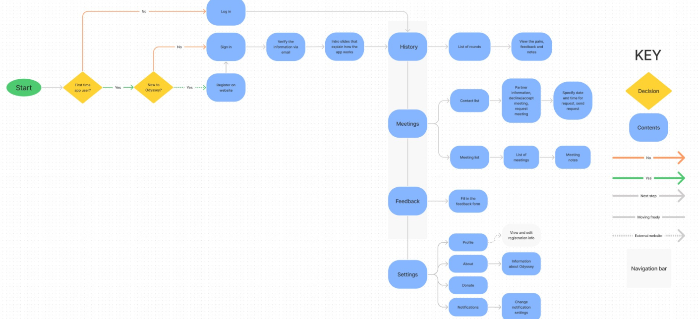
The first version of our flowchart had quite alot more pages and 5 items in the navigation bar. We got feedback from the programmer that it should be more simple and preferably have less pages, which is exactly what we did. After discussing all the pages with the client and some changes during the project, this is the final version.
First layouts
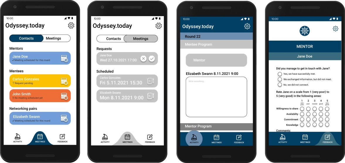
These are some of the first layouts we did before settling on a specific style. We were experimenting with different colours, icons and shapes. These were done to show our client something visual and give a better picture of the UI we were planning. Based on the clients' feedback and user testing, the layouts were improved multiple times.
User testing
We had 5 testing participants that were all already memebrs of Odyssey.today. The test consisted of 11 tasks and 7 questions and lasted about 20-30 minutes depending on the participant. All of the participants said that overall the app was easy to use and they would be interested in using it when it's ready.
The following changes were made besed on the results of the test.
BEFORE
AFTER
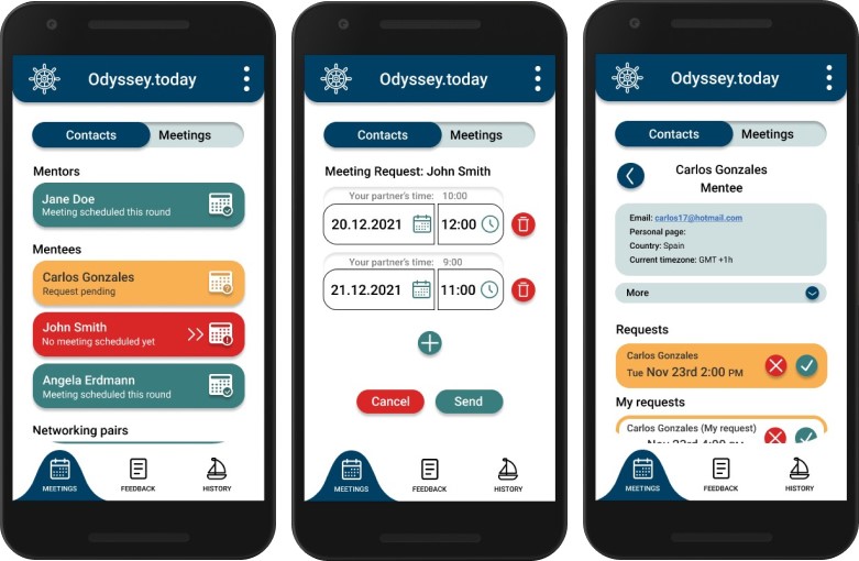
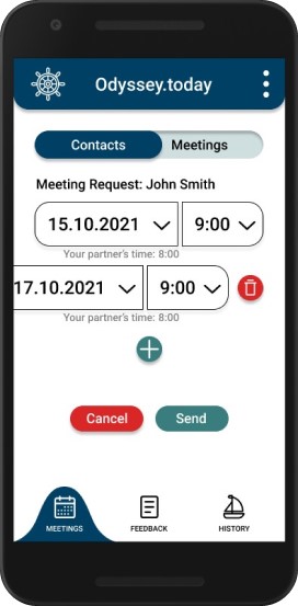
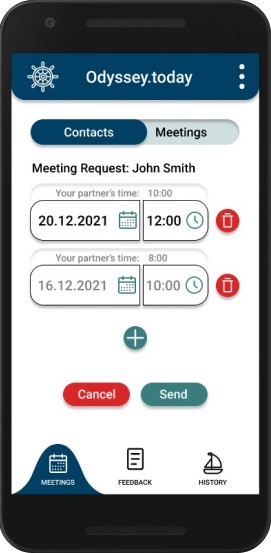
Meeting requests: delete button
The most challenging task for participants was deleting requests. The delete button only appeared after swiping the request, which wasn't that intuitive for the participants. Instead, in the final version the delete buttons appear automatically when the user adds a second request.
The location of the “your patner's time” text was changes according to the programmer's feedback.
BEFORE
AFTER
Meeting times & notes
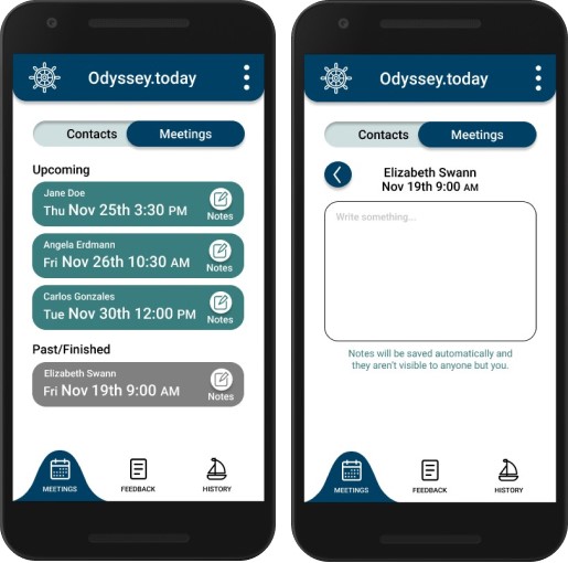
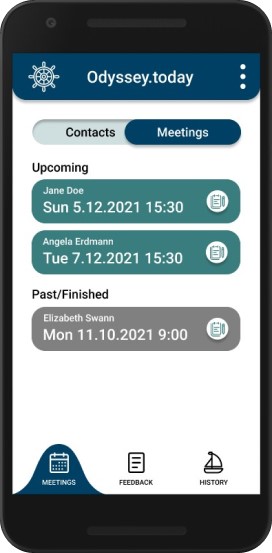
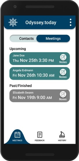
One of the feedbacks we got was that the dates and times on the meetings looked a bit confusing. We decided to change the text sizes and the expression of the date to a more internationally understandable version.
Another task that turned out to be difficult in the test was finding the meeting notes. That's why we added a text under the icon and changed the icon to a more visible one.
BEFORE
AFTER
History: Back button
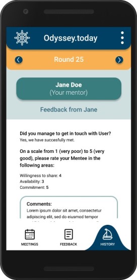
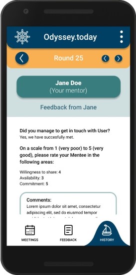
Some participants struggled with getting to the previous page on the history tab. The arrows on the top could only be used to move between the rounds and. To get back, the users had to click on the navigtion bar. Since the left arrow was confused for a back button, we added an actual back button in it's place and moved the arrows to the right.
Final product
See the interactive prototype HERE!
Here are the final layouts that were mainly my responsibility.
